http://addiekosmaczewska.tumblr.com/
more followers makes for a more interesting life please

Wednesday, 21 September 2011
Tuesday, 6 September 2011
NEW YEAR NEW BLOG
http://addiekosmaczewska.tumblr.com/
I'm going to be blogging on Tumblr from now on, although I'll still be reading all your blogs uploaded here too :)
Don't hesitate to follow/link me to your Tumblr!
New year/New blog
I'm going to be blogging on Tumblr from now on, although I'll still be reading all your blogs uploaded here too :)
Don't hesitate to follow/link me to your Tumblr!
New year/New blog
Tuesday, 16 August 2011
Wednesday, 4 May 2011

James Derwin / Event / Immersive Worlds Contemporary Art Exhibition
I went to go and see this free Contemporary Art Exhibition when I was back home in Devon over Easter. The Spanish Barn in Torre Abbey is only 5 minutes from where I live, so it's always a nice surprise when there's something going on. The work shown there was quite interactive, but if the viewer did not choose to interact, it remained quietly in the barn, making it feel a little bit spooky. Artists showing their work were: James Derwin, Phil Dixon, Linda Khatir, Michele Whiting, Clem So, Rik Pitman, Beth Jenkins, Carl Cashman, Sarah Baker, Daryl Mearing and Helen Tranckle. Here's a quick photo from the exhibition; me surrounded my a chandelier made from old reading glasses.

Tuesday, 3 May 2011
Positive & Negative Space: Content Analysis and Representation led by Paul Bailey
'How do we identify what is positive and that which is negative about London on a
day-to-day basis? How do we digest this information? Do we always experience
an equal measure of both?
You will visualize your findings utilizing simple info-graphic methods.'
I've always had an interest in well-presented and clever infographics, so I was quite looking forward to Paul's workshop. We were told to bring in a daily London newspaper, which we ended up dissecting by determining between the positive and negative in the content of the paper, and marking these with post-it notes. After this, we swapped papers with someone else and looked in to how they had overcome this task.

After completing this, our main task was to analyse this content and then represent a positive/negative visualisation using our own infographic methods. We highlighted how we sorted the content using a key stating whether the information was negative/positive/neutral/image or text. We were shown a quote which I found very interesting and appropriate in how to approach infographics by Christina Van Vleck:
'Giving shape to meaning... distilling information down to its most essential and meaningful elements;
sorting and organizing until the patterns come to the surface; bringing clarity and focus to what initially feels overwhelming; providing a layered visual experience encompassing both the big picture and, at closer examination, the smaller details. '
_Christina Van Vleck
 |
| Content Analysis and Representation |
Rules: The Architecture of lines led by Karl Foster
'A geometric line used as a graphic enhancement in page assembly - the term is
used to distinguish ruling lines from a line of type. A line can be used to represent
almost any idea that a designer can conceive.
In this workshop you will use the power of line to express your understanding of
3D structure.
Using the materials supplied by your tutor you will create the very fabric of London.'
Today's morning session with Karl was quite enjoyable, and a nice, relaxed start to the term. Again, not really knowing what to expect from the above brief, I was pleasantly surprised. The group were split in to teams of 6 and then given the brief to 'design a new iconic landmark for London to act as a major and permanent visitor attraction. Londoners can enjoy a ‘must see’ destination, which will help to regenerate London.'
We were given paper craft straws to construct whatever landmark we wanted, which we had to fix together with the materials provided. Our team created a pyramid-based architectural building by all creating pyramid structures and then assembling them together in order to make a more visual piece. We worked well as a team, as everyone was involved and no one took over too much. As for the result, I think we were all pleased with what we had come up with as although we had a basic idea, there was some free-styling involved, so the outcome had an element of surprise to it. What I like about the structure is that it works well from many angles and viewpoints, which gave us the idea that the building would be based in the Olympic Park as a viewing platform. Below are a few photographs of our structure, and what some of the other groups in the session produced today.


Monday, 2 May 2011
Point, Line & Plane
Point, Line & Plane: Mono-printing led by Rachel Ortas
'Your will explore and experiment with different mark making techniques using
mono-printing, which is a fast and effective way to achieve strong, graphic results.'

'Your will explore and experiment with different mark making techniques using
mono-printing, which is a fast and effective way to achieve strong, graphic results.'

Shade
Shade: Silhouettes led by Darren Raven
'A silhouette is the image of a person, an object or scene consisting of the outline
and a featureless interior, with the silhouetted object usually being black or some
other solid colour or texture. The silhouette is a powerful tool in graphic
communication – it’ s both specific in what it conveys and yet vague in leaving out
most of the details for the viewer to fill in for themselves.
In this workshop we will work with silhouettes to produce large images that,
similarly to silhouettes themselves, cause the viewer to fill in the gaps.'
In this workshop with Darren, we used silhouettes to create images to represent London using illustrator to work with vector images that we found on the Internet, and that were already downloaded. The key to a successful piece of work was to keep it extremely simple but also witty. However, I found working with these vector images a little bit boring and decided to take a more traditional approach to the word 'silhouette' using the traditional method of cutting to produce images.
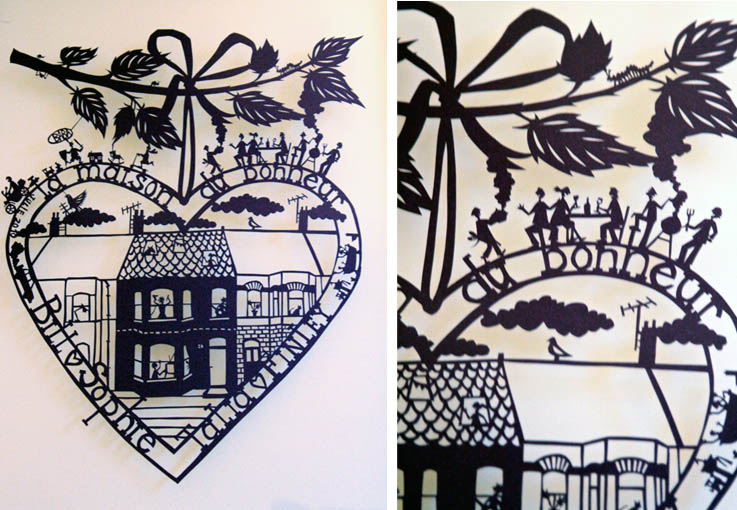
After researching silhouettes on the Internet, I came across a few designers that really inspired me to make my own work. 'Famille Summerbelle' creates some amazing paper cut designs that feature such delicacy, and are extremely attractive to look at.

Repitition/Interruption
Repetition/Interruption led by Katy Oswald
'The action of repeating something over and over is called repetition. This is
true for any item that needs to be remembered or needs to make an impact
on someone. Our minds learn through the repetition of thoughts, ideas, and
visual clues, which is what makes the technique of repetition a valuable
communication tool. As well as design elements such as using typography
that is uniform in size, alignment, and weight rules of repetition we will also be
looking at repetition of theme, viewpoint and of form.
Inspiration will be taken from artists such as Berndt and Hille Becher, Warhol,
Muybridge, Banksy and more...
In groups we will explore Repetition/Interruption using the following media
01. Using the word ‘London’ as a piece of typography either on the lap top or
printed out.
02. A Camera
03. A pencil/crayon.
0.4 A sheet or sheets of coloured paper.'
This was quite an enjoyable, relaxed session, which also had a very open brief so the results produced from this workshop could be extremely varied. Here are a couple of ideas I created using the word 'London' repeatedly.


And a few photos I took around Elephant and Castle featuring repetition...


Composition
Composition: Dual-platform Formats, led by Paul Bailey
'How can you compose a piece of design to satisfy two functions 1) poster 2)
dust-jacket? You will explore the use of grid systems, experiment with folding
techniques and enter the exciting world of designing for dual-platform formats.
This workshop will assist you the wrap-around dust-jacket element of the MP01
brief.'
Paul's workshop was one of the most valuable to attend in my opinion, as I was completely confused as to how the dust jacket would work well as both a attractive book cover and a poster. First of all we looked at the presentation Paul had made about grid systems, which encouraged me to get more information about these from the library. Then, we were given a folded piece of card and some paper, which we could modify however we wanted to create a dust jacket/poster. Here is what I produced during the session.


However, I will continue to play with ideas to make it as successful as possible. One of the best things about the workshop was seeing all the different outcomes that were possible to make from one piece of paper, and inspired me to be even more creative with the dust jacket.
Contrast
Contrast: There are least two sides to every story led by Karl Foster
Before attending Karl's workshop, we were sent a list of all the workshops which announced what to expect from the sessions.This is what the briefing to Karl's workshop stated...
'Methods of creating contrast among elements in the design include using
contrasting colors, sizes, shapes, locations, or relationships. For text, contrast is
achieved by mixing serif and sans-serif on the page, by using very different type
styles, or by using type in surprising or unusual ways.
London is a city of many contrasts. In this workshop you will be producing a series
of images that reflect the personality of London and it’ s many contradictions.'
The work we produced in this session however was not at all what I expected! We looked at the different areas of London and contrast by investigating in to Coats of Arms. There were some online sites, for example the V&A site which allowed us to quickly construct a standard coat of arms. Here is one I quickly made in the session.
 |
| 'Per fess sable a chevron argent three roses gules.' |
London through the eyes of a Designer
After working on our final project of the year, 'London through the eyes of a Designer' for a few weeks now, I am posting some information on a few of the workshops and some of the outcomes of these on here.
The brief is to construct a book and wrap around poster of visual research presenting a body of work that communicates the diversity of life and culture of London. The criteria we need to consider when making this book is:
• for you to explore the city of London as visual designers
• to investigate a range of fundamental design principles and apply them to graphic communication situations
• to utilise a wide range of communication design techniques, processes and research methods
• to help you discover areas within graphic communication design that reflect your professional ambitions and
personal interests that you will develop further in the 2nd year.
This brief at first excited me, as it seemed so open, enabling us to do what we wanted with it. However, as we do not need to consider any particular theme inside the vast subject of 'London', thinking about constructing a book is too daunting to consider as of yet. Therefore, as Darren has suggested, I have been turning up to the sessions with an open mind, and making the most of them so I have some outcomes I can work with later on.
Monday, 14 March 2011
Final Crit
It's our last day with ICODesign tomorrow, which is a shame because it's been an amazing project! Just finished my sketchbook for the project too! :) Now all that is left to do is talk about how we're going to exhibit our work.

Monday, 7 March 2011
Icodesign Typography
So the deadline for our typographic books to make it in for printing is tomorrow, and I have to say it has been a hectic week. My flatmates haven't seen me at all this week, I've been stuck in my room like some sort of hermit. However, I've finally got my 28 pages up to a satisfactory standard. Of course, I would prefer another week (or month) on the project, as I really feel I could improve on some of my designs. However, I am also really pleased with a few of the outcomes I have come up with, a few of which I shall upload here.
Even though I'm handing in my work for the project, our work with ICODesign is far from over. As our group will be holding an exhibition of our work, we will still need to work on the posters and advertising for it. This has so far been my favourite project since being on the course, so I hope the next couple of weeks are just as enjoyable!
Here are a couple of my favourite designs, you'll have to wait for the book to see the rest!
 |
 |
Sunday, 27 February 2011
The amount of work that has collected is a little overwhelming! As well as making the first draft of my 28-page book for ICODesign, I also have to finish my PPD portfolio, VCT essay, research for the VCT timeline and a pdf for the Julia project. Therefore, a trip to the library was definitely needed; here's what I'm reading...


Thursday, 17 February 2011
Icodesign
Tuesday was our first meeting with Steve Lloyd and Vivek Bhatia from Icodesign to discuss our new Term 02 project brief. The simplified version of the brief is basically to create a book with content from social media on 16/02/11, using only typography. Steve and Vivek first explained their working process by showing us examples of their work, and then went on to explain and take questions about the brief, which got me feeling really inspired. As a method to help us understand what we were supposed to be doing with our content from the social media, we were given an example from one single twitter post:
'Space in typography is like time in music.'
We were split into groups of three, given photocopy credit and half an hour to create a typographic poster from this quote.
 |
| Our groups work |
 |
| Steve Lloyd talking through our work |
I'm now very excited for the next session with Steve and Vivek. By then we should have chosen and collected content on the subject chosen for this projects work, and thought about possible ideas and layouts for the book. Looks like I'm going to be busy over the weekend!
Monday, 14 February 2011
Making a typeface
I had some spare time today, so I had a little browse on the Internet at programs used to make typefaces. Immediately, I came across the program 'Fontographer', so I downloaded the demo as I have been interested to see what is involved in making a typeface. Obviously, as I have no experience in doing this, I wasn't really thinking at this point of the actual outcome of the typeface, but the process involved- little did I realise how time consuming it was!
First of all, I quickly filled out a Font Creation Sheet with the Lower and Upper case alphabet, and numbers from 0-9. This was then scanned in to the computer and opened in PS.
 |
| Click on images for a closer look |
The characters were then copied in to 'Fontographer' and then you had to choose the 'Auto trace' option where the tighter you set a curve fit, the more points will be placed on your glyph. By having more points, the tracing will more closely resemble the original image.
 |
This process is quite time consuming and you can also play around with editing the points to create different shapes for your typeface. Once you have created all the glyphs you want in your typeface, your sheet should look something like the image below (annoyingly, I had created the whole alphabet but the demo version of the program only saved a certain number of glyphs.)
 |
When this has been done, you can generate a font file into an Open Type TT/ Windows True Type (.ttf) file, so you can generate a typeface that can be installed and used in other programs!
 |
 |
As I mentioned earlier, the program is only a demo version, so the maximum number of glyphs it would let you generate was only 20 characters, which was slightly annoying as I did not notice this when creating the entire alphabet. Also, the company have used watermarks over the letters when exporting it as a font, so this is the reason for the white marks on the images. However, I wasn't looking to create a brilliant typeface in the first instance, and I feel I have learned a lot from this process for future reference.
Friday, 11 February 2011
Whitechapel Gallery
John Stezaker
I went to see the John Stezaker exhibition which is currently on display at the Whitechapel Gallery today (and will be until 18/03/11.) After hearing about the exhibition from a friend, I felt I had to go and see Stezaker's work whilst I had the chance, as his practise is very similar to the 'postcard project' we had to complete at the start of term, and this was something I thoroughly enjoyed. The work displayed at the gallery showed a fascinating variety of collages using movie stills, vintage postcards and book illustrations, giving old images a new meaning. The techniques used in his work, such as inverting and slicing, are very simple yet extremely effective. Below are a few images I took inside the gallery, the quality is compromised by the glare of the frames, however you can still see how visually pleasing the work is.


Keeping it Real: An Exhibition in Four Acts
Act 3: Mona Hatoum: Current Disturbance
'Current Disturbance' by Mona Hatoum, was another exhibition I was able to visit whilst at the Whitechapel gallery. The gallery is full of stacked wire cages. light bulbs and the sound of electric currents, which brighten at irregular times, lighting up the whole room. Although this isn't the sort of art I usually enjoy, the fact it involved both sound and vision drew you in to the piece and captivated you.
Thursday, 10 February 2011

Type Experimentation
I've been looking back on some typographic work I experimented with a while ago. It makes me want to use more workshops and update the blog with more of this sort of stuff, so this is what I plan to do.
 | |
| Sketching typo ideas |
 |
| Using ribbon to create type |
Monday, 7 February 2011
Julia exhibition
Today was the day of our formative assessment of this terms project- Julia typographic project, where we showed our final ideas in a mini exhibition. I found the day really enjoyable, and it was good to see how everyones ideas had progressed since showing our initial thoughts in the PDF presentations. Erwin and Hugo from 'Julia' provided us with some really informative and helpful feedback. The feedback our group received was really positive, and the guys from Julia really seemed to appreciate the work that Jordan and I put in to the project. I actually really enjoyed the process of formulating idea, especially in the last week where we used the letterpress room more than I ever had before, and this is something I definitely want to do more of. Below are some photos taken of a variety of final ideas from the exhibition.
 |
| Our final product- Mrs Eaves Wedding invite |
 |
| Envelope for our invitation |
 |
| Julia exhibition |
 |
| Bell |
 |
| Courir New |
 |
| Microgramma |
 |
| Beo Sans |
Subscribe to:
Posts (Atom)